The Evolution of Type Foundries: From Metal to Digital Craftsmanship
Table Of Contents
Type foundries have played a foundational role in how humans communicate visually. Long before digital fonts existed, artisans crafted individual metal letters by hand, shaping the visual language of books, newspapers, posters, and official documents. The earliest type foundries emerged in Europe during the 15th century following Johannes Gutenberg’s invention of movable type. These workshops were places of both technical precision and artistic expression, where skilled craftsmen cast metal letters from molds and carefully refined them for consistent printing quality.
In the era of metal type, every letter was a physical object. Foundries were responsible for designing letterforms, producing molds (matrices), casting type, and distributing complete sets to printers. This meant typography was constrained by physical limitations: weight, storage, durability, and the cost of production. Fonts were expensive investments, and printers often built their entire visual identity around a small set of typefaces they owned.
As industrialization spread, type foundries evolved into larger commercial operations. Companies like Caslon, Baskerville, and later Monotype and Linotype developed signature typefaces that became deeply associated with specific eras of publishing. Typography during this period reflected cultural shifts: elegant serif fonts dominated books and newspapers, while bold sans-serifs emerged with modernist design movements in the 20th century.
The transition from metal to phototypesetting in the mid-20th century marked a turning point. Instead of casting metal letters, foundries could now produce fonts as photographic negatives. This dramatically reduced costs and allowed designers more freedom to experiment with new styles. Type became lighter, more experimental, and easier to distribute. However, phototypesetting also began to detach typography from craftsmanship. The tactile relationship between designer and material slowly disappeared.
The digital revolution transformed type foundries once again. Fonts became software files rather than physical products. This democratized typography: independent designers could release fonts globally without owning factories or distribution networks. Digital tools allowed precise control over curves, spacing, and hinting, enabling new levels of refinement and customization. Variable fonts now allow a single font file to contain entire families of styles, weights, and widths.
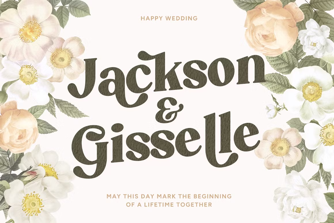
Modern type foundries operate at the intersection of art, technology, and branding. They create typefaces not just for books and posters, but for apps, websites, user interfaces, and global corporate identities. Many foundries focus on niche aesthetics: retro revival fonts, minimalist corporate families, expressive display fonts, or culturally inspired scripts. Typography today is no longer just about legibility—it is about personality, emotion, and storytelling.
Despite the digital shift, the spirit of traditional foundries still influences modern typography. Concepts like balance, proportion, rhythm, and contrast originate from centuries-old craftsmanship. Even contemporary designers who work entirely on screens study historical typefaces to understand why certain letterforms feel timeless and trustworthy.
In a world saturated with visual noise, well-crafted typography remains a powerful differentiator. Type foundries today are not just font producers; they are cultural curators. They preserve typographic heritage while pushing visual language forward. Whether designing for a luxury brand, a tech startup, or an editorial platform, the DNA of the old metal foundries still shapes how we read and perceive the world.